My go-to website layout recipes
Have you ever wondered why you get on some websites and it’s easy to follow and when you get on another one, your eyes are just moving everywhere?
Or perhaps as you’re designing or re-designing your website, you are overwhelmed by how to organize the photos and content on your website
And so… you find a template (and nothing wrong with that) only to realize that after you have added your content and your photos, the template now doesn’t look as good as it did when you choose it.
If you’re nodding your head at all this, then you’ve arrived at the right spot because I too have experienced all of this conundrums.
So I continued to learn, to design and to make mistakes.
Just like a cooking recipe, you need to first get the basics down first before you can add some truffle salt and replace that butter with olive oil (and please never do that, food just taste better with butter ya know )
So here are the basics:
1) Decide what you are building the website for and organize that into primary goals, secondary goals and tertiary goals. Like cooking, you’re probably prioriziting your food to taste food before it looks good. Same with websites!
2) What pages will your website have? Some common pages would be the homepage, about page, contact page, and pages specific to the industry that the business is in.
Once you’ve decided on the basics, here are my favorite 2 layouts and why I use both in every website I have created in the past two years.
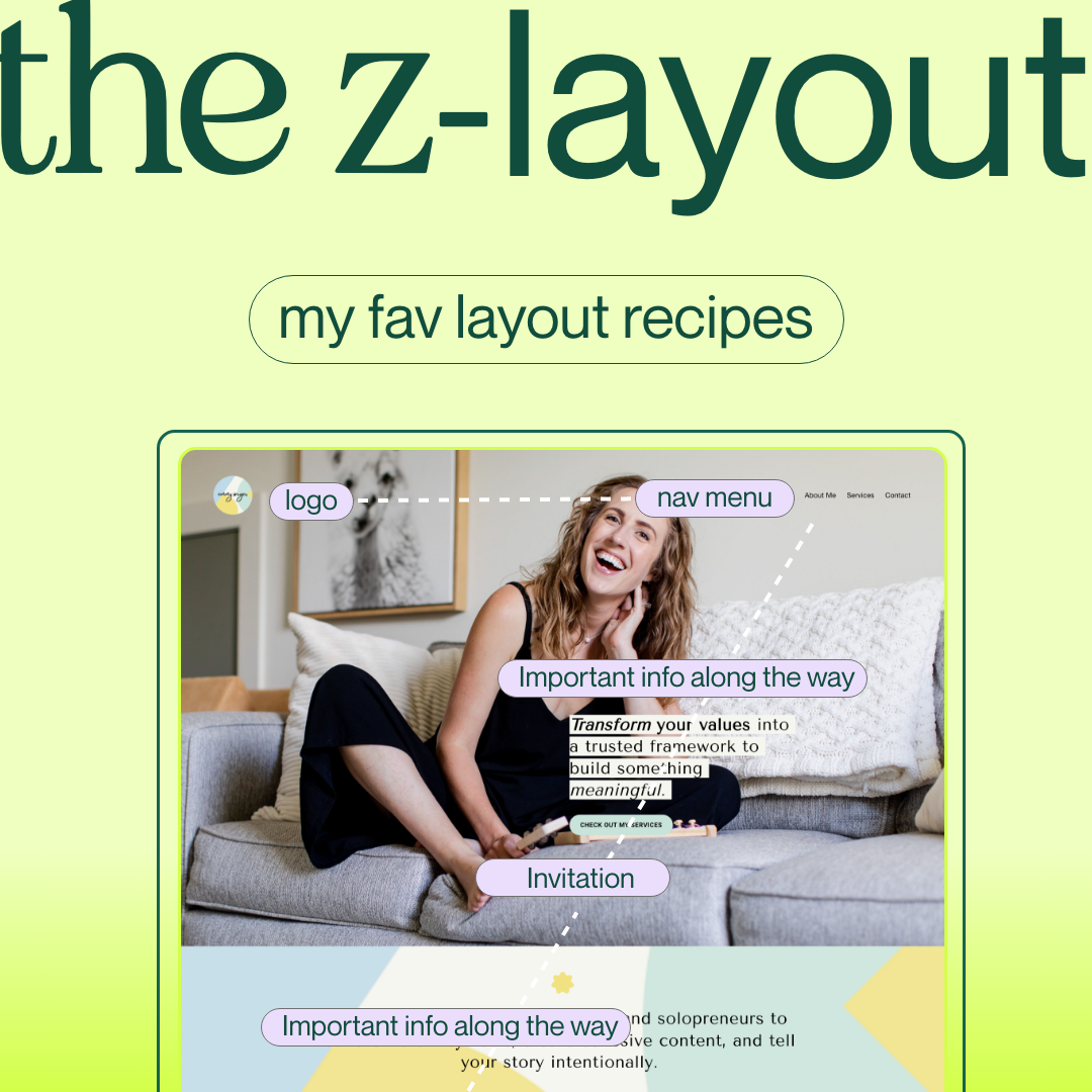
The Z layout
The Z layout is a visual hierarchy layout that tracks a human’s eye movement when they read latin based languages such as English. The human eye left to the right and then from top to bottom. However, if your reader speaks a different language such as Arabic - then the human eye will track from right to left and then top to bottom.
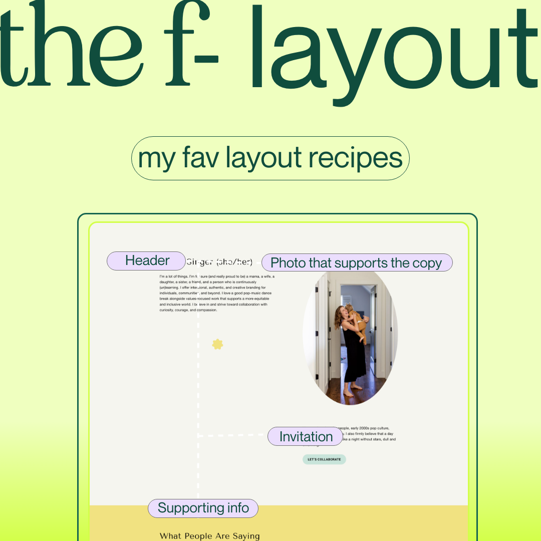
The F layout
The F layout is also a visual hierarchy that gets the human eye to focus on specific information. I tend to use this layout for explanation based content vs. a call to action type of content.
I’d love to see what you’ve come up with with these tips in mind. Would LOVE to see how you’ve used these tips for your own website or other websites you are designing!
Are you a yoga teacher looking to create a stunning website that captures the essence of your practice? In a digital world where first impressions matter, finding the best fit for your website is crucial. But with so many options available - custom websites, templates, or DIY - how do you choose the right one? Our must-read guide for yoga teachers delves into the pros and cons of each option, helping you make an informed decision.
Meet Pear Tree Wellness: a unique private practice website blending diverse modalities for tailored therapeutic experiences. Dr. Simone's warmth and clinical expertise shine, making it one of the best Squarespace therapist websites.
Reframing Karma Yoga as the yoga of action, it emphasizes how our shared reality is a mosaic woven from our combined aspirations. Encouraging us not to abandon our dreams amidst challenges, it champions the alignment of diverse visions toward a world of universal happiness and freedom.
Three (3) Squarespace blocks that you can use to your advantage to display content and copy on your site without needing to cut your thoughts short.
Yoga for Good is a neighborhood yoga studio in Oxford, North Carolina. When Darcy started practicing yoga, she realized that there was not a place in her neighborhood where neighbors, residents and people passing by could practice yoga together in respect of their differences.
As someone who designs brand marks and visual identity for non-traditional wellness brands, this past is something that I often think about in the modern world.
Lynn addresses healing from a systemic point of view as a lens into deep healing. Because of their experience and knowledge, Stillpoint offers a variety of offerings has bridged the gaps towards healing.
If you’re wondering what and why intersectional design, I wrote this short version just for you!
words for the many in-between moments of 2022.
Over the years, I’ve experimented with naming my social location in many different ways but it was not until recently that I realized why an analysis of identity brings clarity of how I may appear in space.
You are looking for ways to build your yoga brand that is rooted in justice, but quite frankly you feel a bit disorientated, you can’t find tips on google that applies to you and that don’t have a clear idea as to where to start – or if it is actually possible.
Have you ever wondered why you get on some websites and it’s easy to follow and when you get on another one, your eyes are just moving everywhere?
Having a hard time choosing a font and how to size your font? I totally get it. Whether you already have an existing font choice or looking to find a give your brand a font glow-up
I’m so proud to share this website for The Coterie. The Coterie is a Charlotte wellness studio offering three types of movement-based classes that allows you to get more in touch with yourself.
Designing a podcast cover “It’s not you, it’s the system’ for Lauren Kay Roberts, an anti-capitalist coach and founder of Take Up Space.
However, with a little effort and some tips, you can be well on your way to offering sliding scale on your Squarespace website.
Are you wanting to move beyond donation based classes into a more sustainable long term pricing rooted in equity but don’t know how?
You’ve thought about writing a land acknowledgement on your website but you’re wondering if it’s performative and if having a statement on your website is enough.